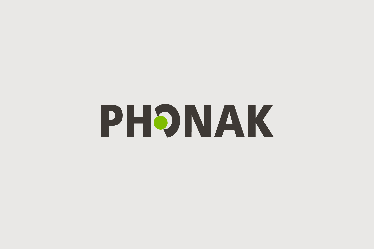
Phonak logo
Client: Phonak
Role: Logo Design, Corporate design
Credits: SNK (ci/cd)
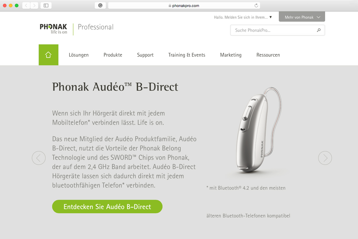
Phonak, a leading global hearing instruments manufacturer, faced a challenge in optimising the placement and application of its 2009 logo. As a proficient graphic designer well-versed in the brand’s ethos and obstacles, I was tasked with redesigning the logo. Given Phonak’s prominent standing and extensive reach, I opted to eliminate the two squares while retaining the original wordmark and imbuing it with a contemporary flair by selecting a dark graphite color scheme. The outcome is a simplified yet identifiable logo. Furthermore, I updated the secondary color palette to align with the fresh, more dynamic tone. The new logo was seamlessly integrated into the comprehensive brand update conducted by SNK (Zurich).
